How to Add Gradient Strokes to SVG Paths
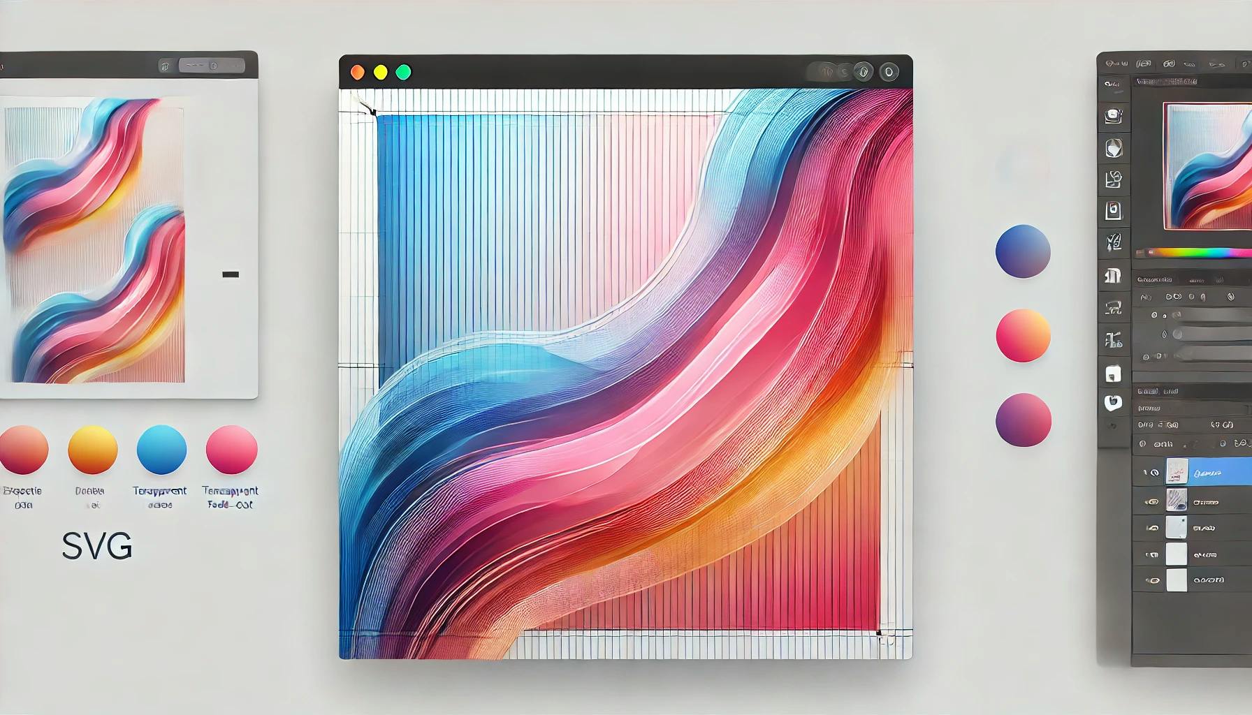
Adding gradient colors to an SVG line enhances its visual appeal and creates engaging, dynamic graphics. This tutorial will guide you through using SVG's defs tag and the linearGradient element to achieve gradient stroke effects.
We'll also explore how to use RGBA for fade-out effects, bringing a modern, polished look to your SVGs.
Here’s a minimal SVG where we define a path with TailwindCSS classes.
<svg class="" viewBox="0 0 1087 408">
    <path
        class="fill-none stroke-gray-500 stroke-[5px]"
        pathLength="1"
        d="M0.5 139C90 68.5 287 -52.7 359 26.5C449 125.5 297.5 268.5 461.5 251.5C625.5 234.5 555 102 766.5 120.5C935.7 135.3 837 318 766.5 407.5L1086.5 97"
    />
</svg>
Here, the path is gray, has no fill, and has a stroke width of 5 pixels.

<defs>To add a gradient stroke, we need to use the <defs> tag. The <defs> tag defines reusable graphical elements like gradients, patterns, and filters.
Here's how we define a linear gradient
<svg class="" viewBox="0 0 1087 408">
    <defs>
        <linearGradient id="col">
            <stop offset="0%" stop-color="#f542e3" />
            <stop offset="25%" stop-color="#4e42f5" />
            <stop offset="75%" stop-color="#bd7919" />
            <stop offset="90%" stop-color="#0e3bcc" />
        </linearGradient>
    </defs>
    <path
        class="fill-none stroke-gray-500 stroke-[5px]"
        pathLength="1"
        d="M0.5 139C90 68.5 287 -52.7 359 26.5C449 125.5 297.5 268.5 461.5 251.5C625.5 234.5 555 102 766.5 120.5C935.7 135.3 837 318 766.5 407.5L1086.5 97"
    />
</svg>
However, this code won’t apply the gradient yet. To use the gradient, we must reference the gradient’s id in the path’s stroke attribute.
Replace the stroke-gray-500 class with stroke-[url(#col)], which references the gradient defined in <defs>:
<svg class="" viewBox="0 0 1087 408">
    <defs>
        <linearGradient id="col">
            <stop offset="0%" stop-color="#f542e3" />
            <stop offset="25%" stop-color="#4e42f5" />
            <stop offset="75%" stop-color="#bd7919" />
            <stop offset="90%" stop-color="#0e3bcc" />
        </linearGradient>
    </defs>
    <path
        class="fill-none stroke-[url(#col)] stroke-[5px]"
        pathLength="1"
        d="M0.5 139C90 68.5 287 -52.7 359 26.5C449 125.5 297.5 268.5 461.5 251.5C625.5 234.5 555 102 766.5 120.5C935.7 135.3 837 318 766.5 407.5L1086.5 97"
    />
</svg>
Now, the path will render with a stunning gradient stroke.

To achieve a fade-out effect, use RGBA values in your gradient:
<svg class="" viewBox="0 0 1087 408">
    <defs>
        <linearGradient id="col">
            <stop offset="0%" stop-color="rgba(245, 66, 227, 1)" />
            <stop offset="25%" stop-color="rgba(78, 66, 245, 1)" />
            <stop offset="75%" stop-color="rgba(189, 121, 25, 1)" />
            <stop offset="90%" stop-color="rgba(14, 59, 204, 0)" />
        </linearGradient>
    </defs>
    <path
        class="fill-none stroke-[url(#col)] stroke-[5px]"
        pathLength="1"
        d="M0.5 139C90 68.5 287 -52.7 359 26.5C449 125.5 297.5 268.5 461.5 251.5C625.5 234.5 555 102 766.5 120.5C935.7 135.3 837 318 766.5 407.5L1086.5 97"
    />
</svg>
This will add a gradual fade-out effect to the stroke, perfect for creating sophisticated visuals.

<defs> to define reusable elements like gradients.stroke or fill attributes with url(#id).
Getting the "Invalid wkhtmltopdf version" error in Frappe or ERPNext? Learn how to fix broken PDFs, install the patched Qt version, and switch to headless Chrome for pixel-perfect modern CSS and custom font support.

Learn how to quickly expose a localhost server to your local network on Windows using netsh portproxy. A step-by-step guide to accessing local apps from any device.

Learn how to enhance your Frappe Desk UI by adding a custom, dynamic top bar. Follow this beginner-friendly, step-by-step tutorial to display user profiles, statuses, and more!