How to Add Expand & Collapse Sections in DaVinci Resolve Fusion Macros
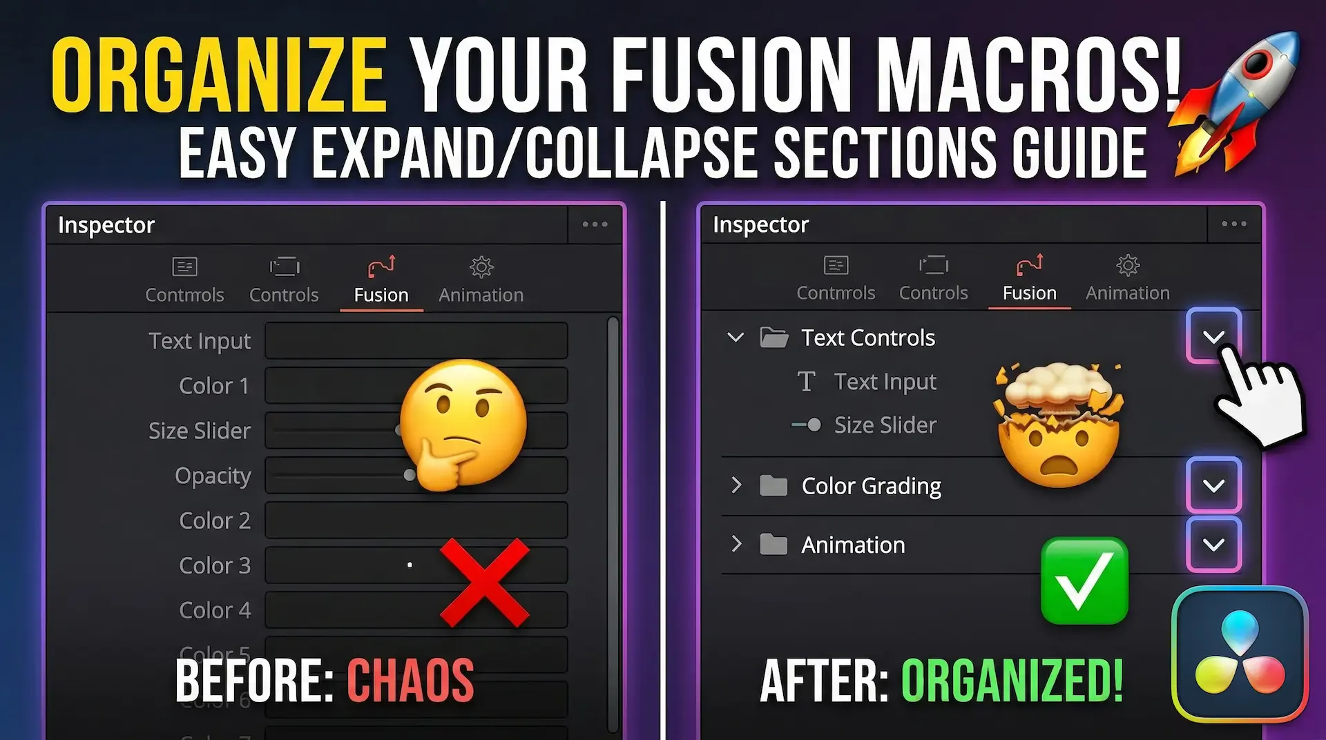
If you’ve ever built a custom macro in DaVinci Resolve, you know how quickly the Inspector panel can turn into a chaotic, unreadable mess. As you pile on color sliders, text inputs, and transform controls, finding the exact setting you need becomes a massive headache.
But what if you could group your controls into clean, organized sections like this?
Text ControlsColor GradingAnimation SettingsGlobal ConfigThe secret lies in the magical Expand/Collapse arrow! In this guide, I’ll show you the exact code pattern you can copy and paste into any .setting macro file to build beautifully structured, professional-grade UIs.
~10 Minutes
LabelControl in Fusion to create custom UI elements..setting code pattern needed to generate dropdown/expandable sections.Under the hood of Blackmagic Design's incredible Fusion engine, .setting files are essentially Lua tables. To create an expandable section header, we need to summon a specific UI element called a LabelControl.
The magic ingredient is this single line of code:
LBLC_DropDownButton = true
When Fusion reads this flag, it automatically generates that satisfying little expand/collapse arrow we all love in modern UI design.
UserControls 🛠️Let's dive into the code. Open your .setting macro file in any text editor (like VS Code). Inside your main controller tool (for example, a TimeSpeed1 node), locate the UserControls = ordered() { ... } block.
Add the following snippet to create your new section:
MySection = {
    INP_Integer = false,
    LBLC_DropDownButton = true,
    LINKID_DataType = "Number",
    INPID_InputControl = "LabelControl",
    LBLC_NumInputs = 4,   -- ⚠️ SUPER IMPORTANT!
    ICS_ControlPage = "Controls",
    LINKS_Name = "MySection",
},
Pay close attention to LBLC_NumInputs. This number dictates exactly how many controls will be nested inside this dropdown section. If you set this to 4, the next four controls in your code will belong to this folder. If you get this number wrong, your layout will completely break!
Inputs 🔗Now that we’ve defined the UI element, we need to tell the top-level Macro to actually display it.
Scroll down to your macro's Inputs = ordered() { ... } block and add the instance input:
MySection = InstanceInput {
    SourceOp = "TimeSpeed1",  -- Replace with your actual node's name!
    Source = "MySection",
    Page = "Controls",
    Name = "MySection",
},
(Pro tip: Make sure SourceOp exactly matches the ID of the node where you built the UserControl!)
DaVinci Resolve reads these menus sequentially. To nest your controls inside your shiny new folder, you must place them directly beneath the section header in your Inputs block.
Remember when we set LBLC_NumInputs = 4? Here is how it should look in practice:
MySection = InstanceInput { ... }, -- The Folder Header

-- The 4 nested controls:
InputA = InstanceInput { ... },    -- Item 1
InputB = InstanceInput { ... },    -- Item 2
InputC = InstanceInput { ... },    -- Item 3
InputD = InstanceInput { ... },    -- Item 4

-- Controls down here will be OUTSIDE the folder
InputE = InstanceInput { ... },
Fusion takes those next N controls and happily tucks them away under your custom label.
You're at the finish line!
.setting file.Want to skip the typing? Copy this boilerplate and adapt it for your next project:
-- 1. Drop this into your controller tool's UserControls block:
MySection = {
    INP_Integer = false,
    LBLC_DropDownButton = true,
    LINKID_DataType = "Number",
    INPID_InputControl = "LabelControl",
    LBLC_NumInputs = 3, -- Change this to match your item count!
    ICS_ControlPage = "Controls",
    LINKS_Name = "My Custom Section",
},

-- 2. Drop this into your top-level Macro Inputs block:
MySection = InstanceInput {
    SourceOp = "YourNodeNameHere",
    Source = "MySection",
    Page = "Controls",
    Name = "My Custom Section",
},
Things not working as expected? Don't panic! Check these common culprits:
INPID_InputControl = "LabelControl" is spelled exactly right.LBLC_DropDownButton = true is present.LBLC_NumInputs integer!Inputs table.Page = "Controls" and ICS_ControlPage = "Controls" perfectly match the page name of your macro's inspector tab.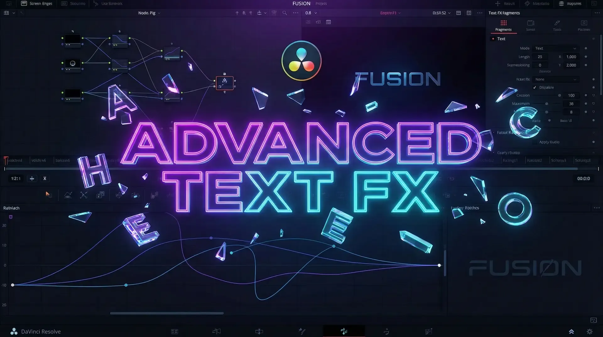
Learn how to create dynamic, character-by-character text animations in DaVinci Resolve Fusion using the Follower modifier, Path keys, and Spline tool
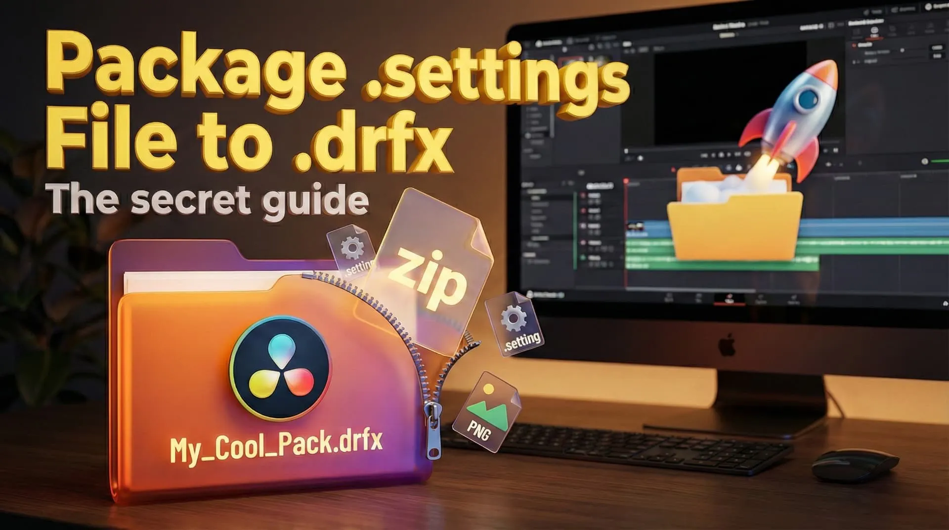
Stop sharing raw .setting files! Discover the professional way to bundles your DaVinci Resolve transitions, effects, and titles into a single, easy-to-install .drfx file
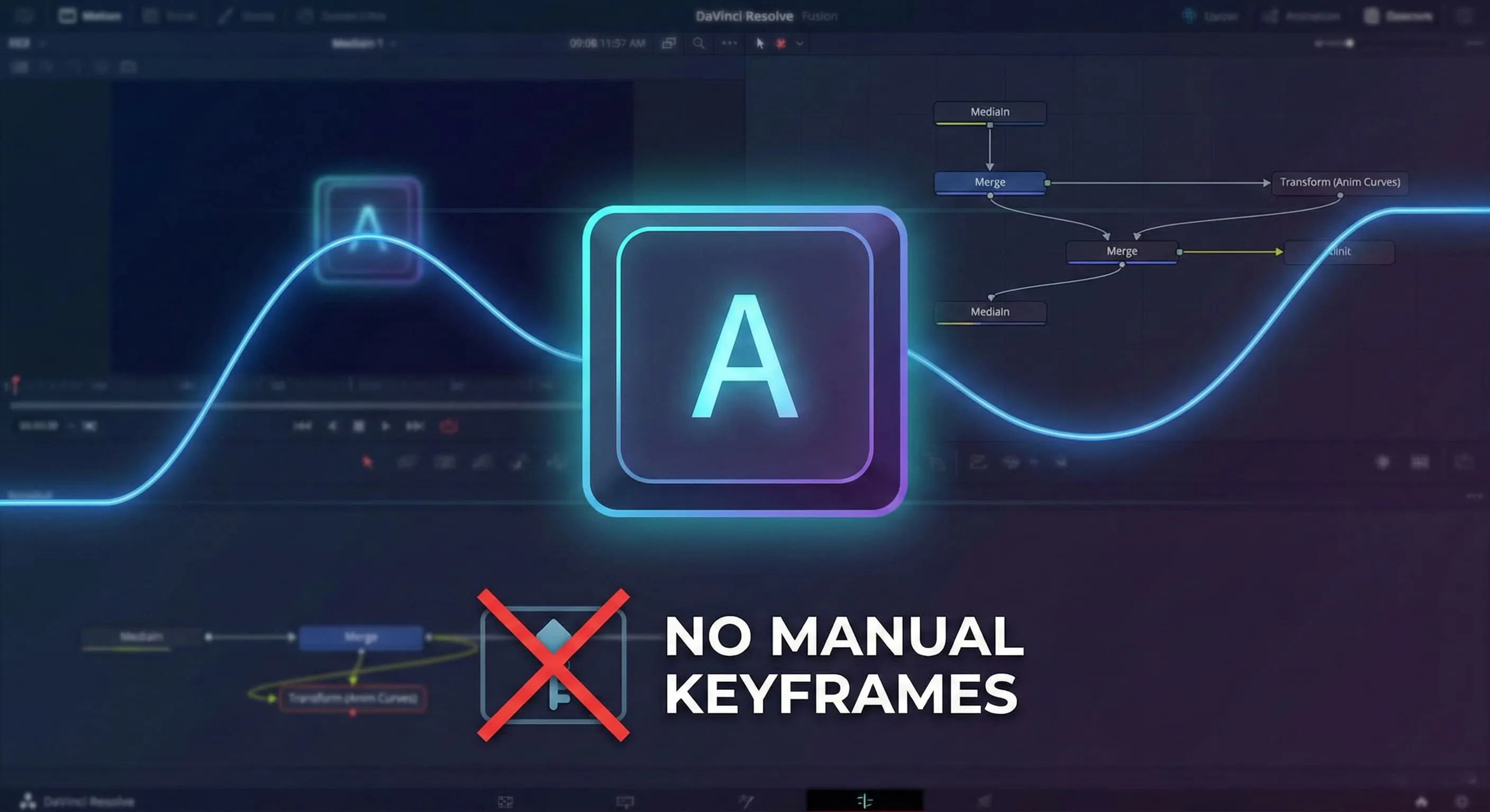
Learn to create dynamic, self-animating keyboard overlays in DaVinci Resolve Fusion using Anim Curves. No manual keyframes required! Perfect for tutorials and gaming videos.